Parc East
A site to showcase a real estate development in Port Coquitlam B.C.
Marketing towards a younger demographic, the Parc East site needed to be crisp, clean, and express the lifestyle of an up-and-coming Vancouver suburb.
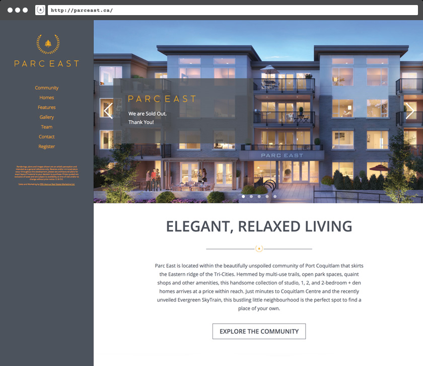
The homepage featured renderings of the building and text about the location and future offering.
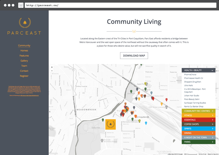
An interactive community map highlighted a custom-made list of the local business and recreational offerings in the development's locale.
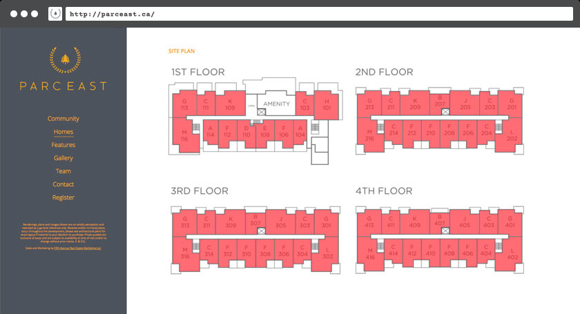
An interactive site plan page showed real-time availabilty of the remaining units grouped by floor-plate
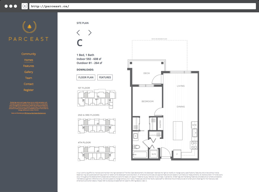
which linked to each unique floorplan, which were also downloadable. The urls in the browser navigation bar were all unique for easy and quick sharing/reference.
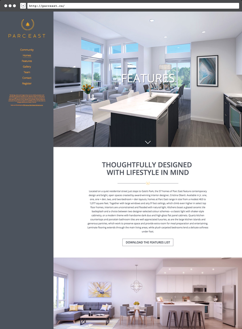
And the feature sheet included a scrollable parallax image gallery that was also downloadable.
Conclusion
A key feature for this site was the real-time availability for the units, which hid-off each unit as it was sold or put on hold. This encouraged the sales people to use the site not just as a reference or as marketing material, but also as a sales tool.
